The model produces a wide range of outputs that can be used to understand the nature of a given model scenario, or compare the outcomes of two scenarios.
Key system performance indicators
Vehicle kilometres travelled (VKT)
Vehicle kilometres travelled (VKT) is a measure of the transport task — the more travel there is, the higher the VKT. It is loosely related to the efficiency of the land use transport system, in that all else being equal, it would be better if VKT were lower. However it is more strongly related to activity — people travel because they want to get to other places, and VKT is a measure of how much they are doing that. Thus an increase in VKT is not necessarily a problem — new roads will often lead to more travel as people take up new opportunities for travelling to more attractive destinations.
Note that as well as looking at vehicle kilometres it is also possible to look at the distances that individual people travel – person kilometres travelled (PKT) or Summed Kilometres Travelled (SKT). This is a more useful measure if multiple modes are being compared, or the focus is on the overall personal travel task.
Vehicle hours travelled (VHT)
Vehicle hours travelled (VHT) is somewhat similar to VKT in that it measures activity, but is more sensitive to network speeds. Increases in VHT may be acceptable if they reflect strong growth in demand but, in general, road projects seek to reduce VHT.
Similarly to the VKT discussion above, it is possible to focus on persons rather than vehicles, with person hours travelled (PHT) or summed hours travelled (SHT) showing the total time spent travelling.
Accessibility
Accessibility is a measure of how well someone is served by the combined transport and land use systems. Accessibility can be increased by reducing transport costs, or by providing more or better opportunities (shops, jobs etc). Accessibility is often a better measure than reductions in travel distance or time, as it properly reflects the benefits that people obtain from changes to the system. In fact, some network improvements will increase travel times and distances but still be associated with improvements to people’s accessibility. This is usually due to new opportunities being made available to people. For example, a new road may increase the connectivity to a major centre, leading people to switch some of their travel from the local centre to the major centre. Whilst they are travelling further, they are doing so because they are better off as a result, thus their accessibility is increasing.
The aggregate change in accessibility is an overall measure of the benefits of the project; it is equivalent in concept to the economic idea of consumer surplus.
If a model scenario shows a net decrease in accessibility then it usually indicates that there are some people negatively impacted by the project and that their reduction in accessibility exceeds the gains that are experienced elsewhere.
If the model shows a net increase in accessibility, it does not necessarily mean that there is no-one negatively impacted. It does, however, mean that any areas suffering a decline in accessibility are more than offset by improvements in accessibility in other areas. The accessibility difference plots (described in the model output plot section) make clear the beneficiaries of the project and their relative improvements compared. It also highlights those areas (if any) that are made less accessible by the network changes.
It should be noted that accessibility is a utility measure, and as such it has a number of limitations that are common to all practical utility measures. Firstly, it is based on an assessment of people’s choices and so it is a necessarily relative measure. There is no absolute value to utility – every value could be increased or decreased by a constant amount without changing the relative order of people’s choices. It is also possible to multiply all values by a constant without changing the order. This factor issue can be managed by normalising the numbers so that a certain element has a weight of 1 – in the model we have chosen to normalise to the cost element so the utility numbers can be understood in units of cost (in our case 2016 Australian dollars).
Secondly it is an aggregate of people’s own assessments of their choices – in this way it is similar to a willingness-to-pay approach. If some people place a high cost on some element then the accessibility will be strongly affected by that element. For example, it is clear that people do not like walking and so put a premium on the time spent walking; most people would rather spend 20 minutes driving than 10 minutes walking. Thus the accessibility measure will reflect this preference, even though as a community we would recognise the value in people walking more. Another example is that people who are wealthy will make different trade-offs between time and cost than people with more constrained budgets. The accessibility measure will place a higher premium on savings in travel time for the rich than for the poor, since the rich have indicated a higher willingness to pay for that saving. Again this may be in contrast to the community’s assessment that the difference is more due to differing capacity to pay, and that people’s time should be weighted equally.
For this reason the accessibility measure should be seen as an indicative result for consumer surplus, but is not a substitute for a complete community-based assessment of benefits and costs.
Note that in some of the outputs, the model will use the term Summed Net Utility (SNU) – this is another way of naming the accessibility outputs that focuses on its role as a measure of net utility/consumer surplus.
Note that in literature1 there are alternative definitions of accessibility, most commonly the Hansen Accessibility measure. The Hansen approach is best viewed as a weighted sum of activities (population, employment etc) around a location. It is problematic when used for project assessment because it is non-linear; an area with twice as much activity is not twice as attractive. The utility based approach used in this report does not suffer from this limitation.
Normalisation of accessibility
As noted above, although the accessibility numbers can be scaled to give values in dollars, there is no fixed zero point for accessibility. To allow comparisons between years and scenarios to be done more effectively, we normalise the accessibility to a fixed value. It is not easy to define a fixed value for the worst accessibility – even a very isolated location will still allow people to receive some levels of utility by telecommuting, teleshopping, or enjoying themselves at home. Instead we have chosen a value for the optimal accessibility – this is done by calculating the best possible accessibility value that could exist in a typical city. The best possible value would occur if all the city had to offer was at one location, and we were at that location. Every actual location will have worse accessibility than this ideal value and so this presents an upper limit on how high accessibility could be. We have chosen Sydney as the benchmark, although the values for Brisbane are not very different – this is mainly due to the diminishing return that occurs with increasing size, leading to utility increasing logarithmically with size.
By fixing an upper value for accessibility, all actual accessibility values can be seen as a cost; it measures how much worse a location is than the ideal. In this measure, small values are good and large values are bad. This normalisation has no impact on the differences in accessibility, but can make the accessibility itself easier to visualise. The numbers can be viewed as a cost, but it should be remembered that this is not actually a cost, but rather a measure of how far off the ideal a location is.
Accessibility for multiple purposes
The model calculates different accessibility values for each travel market – a given area may be close to schools but have poor connections to shops. Different combinations of accessibility will be assessed differently by separate groups within society. For example retirees will be unconcerned with accessibility to work, but may want to be close to shops and medical services. To prepare a composite accessibility value we use an approach similar to the way that the ABS prepares the CPI measure. A fixed parcel of travel demands are prepared using information from the SEQ Household Travel Survey. Each travel market is weighted by the average number of trips of that type made by people in a single day (average trips/population). The final composite accessibility is equal to the weighted average of the normalised accessibility of each market segment.
Different types of model output plots
The impacts of each scenario are addressed through seven types of plots.
Volume plot
The volume plot shows how much traffic is travelling down each road in a day, and what the overall composition of that traffic is. The width of each line reflects the total traffic on that road (in equivalent passenger car units – PCU), with the breakdown by colour showing cars, medium commercial vehicles, heavy commercial vehicles and super heavy commercial vehicles. Each of these vehicle types is weighted by the PCU factors for that vehicle type.
The standard volume plot shows all-day volumes for an average weekday (AWDT). The volume numbers shown on the plot are unweighted total vehicle numbers at selected locations.
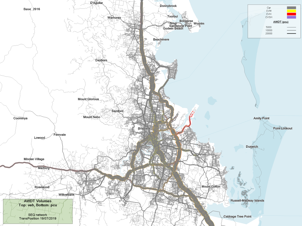
SEQ volume plot
Volume difference plot
This plot aims to outline the differences in traffic between two scenarios. They clearly show the way in which traffic has changed due to the land use or road supply differences between the scenarios. Red indicates an increase in traffic and blue represents a decrease in these plots.
The reason that we produce volume difference plots, rather than simply showing plots of traffic volumes, is that many of the scenarios have only slightly different traffic patterns.
Since the volume differences do not show breakdown by vehicle class, the totals are calculated in equivalent passenger car units (PCU). The differences are more meaningfully compared, since shifting 100 trucks to a new corridor is more significant than shifting 100 cars. It does mean, however, that the differences do not match the total traffic numbers shown on the volume plots (which are simply the sum of all vehicles).
Below is an example of a volume plot being used to asses the impact of a small reduction in toll rode pricing in 2031.
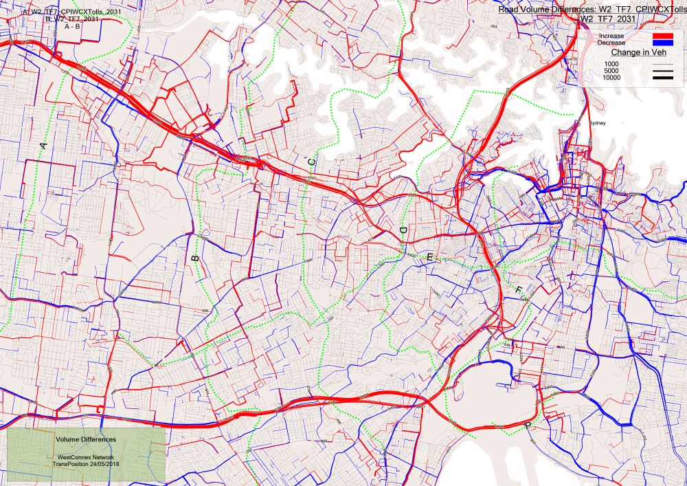
Volume difference plot in Sydney 2031, looking at the effect of reduced toll prices on future toll roads
Volume capacity ratio plot
The volume capacity (V/C) ratio is a common measure for understanding how congested a road is. It is usually calculated as the peak hourly volume (in passenger car units) divided by the hourly capacity. It is generally assumed that there is a strong relationship between volume capacity ratio and Level of Service (LOS). This is complicated somewhat by the fact that the V/C ratio is usually shown for links, whereas many of the delays occur at intersections. Although the TPACS model does have an intersection delay model, the V/C ratio shown on these plots is calculated at a link level only.
The plot shows the V/C ratio for the AM peak (average hourly volume in the 2 hour peak), with each road coloured according to the attached legend. V/C ratios less than 0.6-0.7 are generally good, but higher values can be problematic. As V/C approaches (and in some cases exceeds) 1.0 the road moves into highly congested conditions.
The numbers drawn at selected locations on the V/C plot show the hourly volumes and the hourly capacity at that location. Only the peak direction is included in the numbers, since we are generally interested in the more constrained case and contra-peak flows are seldom an issue.
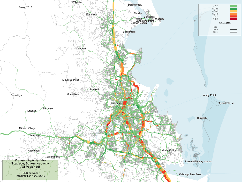
SEQ volume on capacity plot
Accessibility plot
The accessibility plot for a scenario shows how well located each area is—the blue areas have good accessibility (they are closer to the ideal value) and the red areas have poor accessibility. As the city grows over time, more and more values move into the better accessibility colours. This reflects the fact that the larger city offers many more choices with regard to jobs and activities, improving the average accessibility enjoyed by residents.
An example of an accessibility plot is shown below. Here the plot shows the accessibility of tertiary education locations across Melbourne. The accessibility plot can show all travel or can be customised for the market segment or vehicle type of interest.
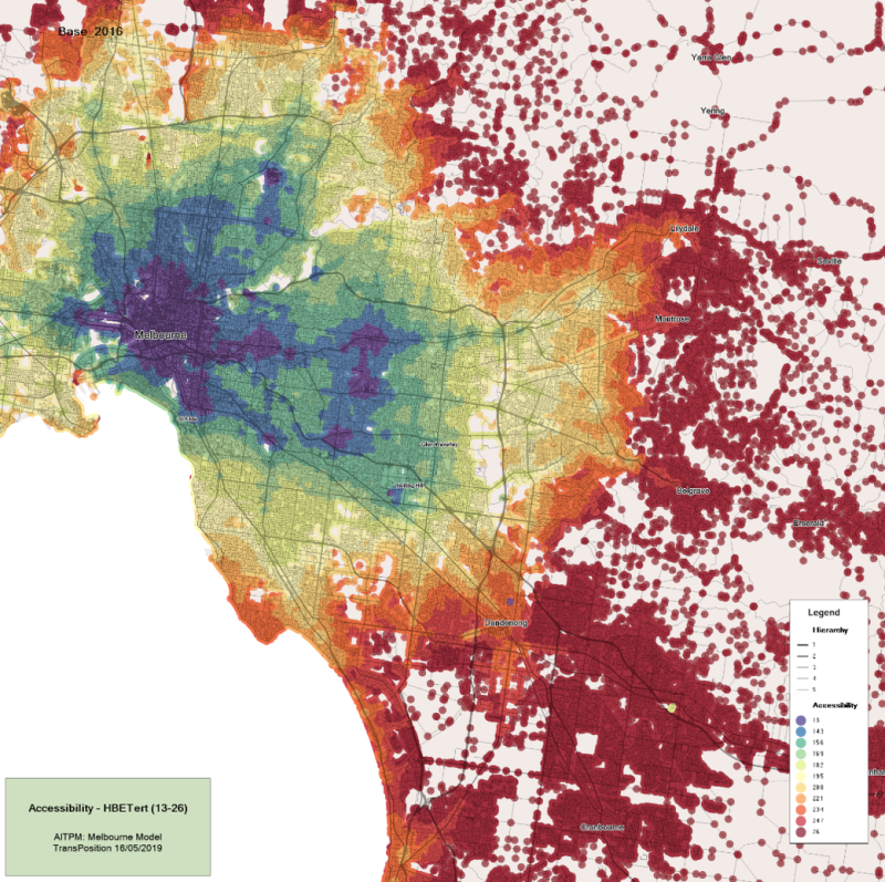
Accessibility to tertiary education in Melbourne
Accessibility difference plot
The accessibility difference plot shows which people benefit or are made worse off from a change between two scenarios, the change can be network, policy, or a travel characteristic i.e. slower walking speeds. It can be seen a a benefit/disbenefit footprint, with green showing benefits and red showing disbenefits; the intensity of the colour is a measure of the degree to which people are impacted.
An example of an accessibility plot is shown below. The plot shows the change in accessibility across the Sydney region when only public and active transport modes are available. Here we can see the strong public transport corridors (in bright yellow) that exist in Sydney. Where public transport options exist there is only a smaller drop in accessibility (smaller then $2.50), which is shown in yellow, where public transport is not an options there is a large drop in accessibility (greater then $20) shown in dark red.
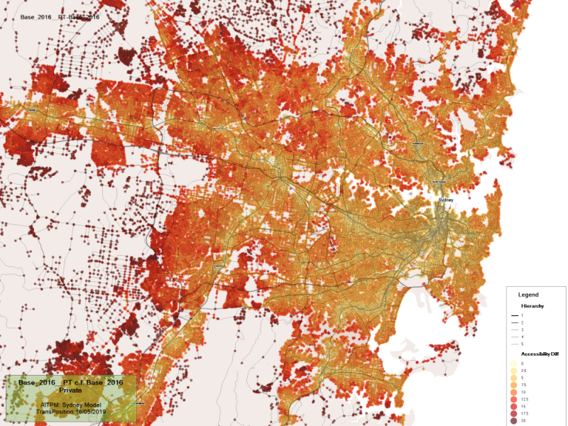
Change in accessibility when only public and active transport is available in Sydney
Note that these plots focus on the benefits to locals — the colours in each area show how their daily travel is improved or worsened. The benefits to regional travel are not seen in these plots, but the aggregate effects can be found through the total net utility changes. These aggregate the results across the whole model area, and so include the benefits for people making longer distance travel. However because most roads are dominated by local traffic (even national highways) it is generally the case that local accessibility improvements make up a large proportion of the total benefit of a project.
Desire line plot
The desire line plots show the overall pattern of demand – where it comes from and where it is going to. Since the full detail of the travel movements is too complex to show on a plot, the data is aggregated by broad regions. The plot shows lines between regions whose thickness is proportional to the demand between those regions. Demand is usually shown in a production-attraction format, rather than an origin-destination format. This means that the plot will show lines from where the trips are generated (usually where people live) to where they are attracted (such as workplaces, shopping centres and schools). This is generally more useful than plots which simply show the direction of travel, since most trips will have a return journey that is roughly the reverse of the outward journey. So a production-attraction desire line will have a thick line going from a suburb to a city centre, but only a very thin line (or none at all) between the city centre and the suburb since there are few people who live in the city who travel to areas in the suburbs. This is in contrast to an origin-destination demand, which would show strong connections in both directions (since people travel from the suburbs into the city in the morning, and in the reverse direction in the afternoon). An origin-destination plot for the morning peak period would have a similar shape to the production-attraction plot.
To make the directionality of the demand easier to see the plots use two visual cues – each line has an arrow at the attraction end, and the lines arc upwards in the forward direction and downwards in the reverse direction.
Even with aggregated areas, there are still many minor movements that could be shown on the plot. Since this would quickly make the plot unreadable, movements with less than a nominated number are excluded from the plot. Similarly, some movements have very large demands which dominate the plot, making it difficult to see other movements. For this reason the plot can also have limits on the maximum width – any demand greater than a nominated value will have a fixed width but is shaded to show that the limit has been reached.
The plot also shows circles at the centre of each region. These represent the intra-regional demand – i.e. the trips that start and and within that region. It is often the case that these trips are much more numerous that the inter-regional demand, and so they often hit the maximum width limits discussed in the previous paragraph.
Each movement is labelled with the number of trips, and the regions are shaded with different colours so that their extents can be easily seen. Note that in some cases the centroid of a region has been shifted – this is usually done for longer trips that would otherwise be difficult to see. The labels that are near these centroids make this clear by showing a small arrow after the name – the real location of the centroid is in the direction of the arrow.
The plot below shows the pattern of demand for Tertiary education trips, in the plot we see that most trips point to the same regions that had high accessibility in the earlier plot (where the universities are located).
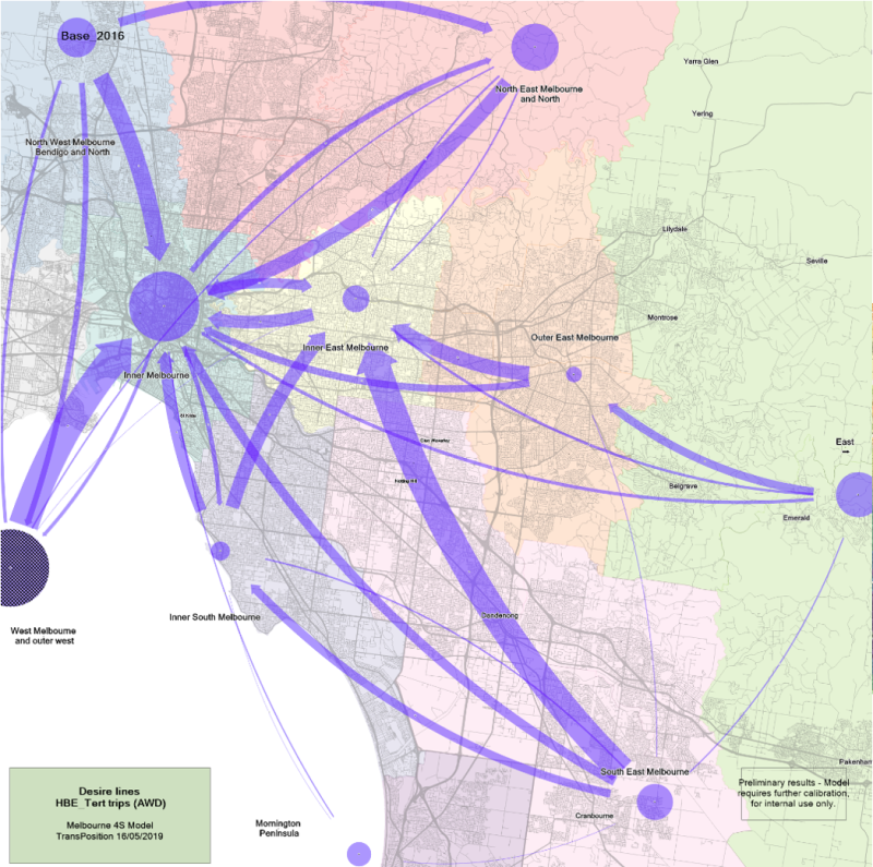
Desire line plot showing travel patterns Across Melbourne for Tertiary education trips
Desire line difference plots
The desire line difference plots show the changes in the trips production and attraction between two different scenarios. The red arrow highlights where the number of trips has increased, whereas blue highlight a decrease in trip numbers. The circle in the centre of each zone shows the changes in intra-sector trip numbers. Not that any changes that occur on the border on the study area, i.e. in this case North, South, West and East zones, will show large changes even if they are actually only small model fluctuation that occur between model runs (the changes are only a very small percentage of the travel in these large regions, but the absolute numbers can be relatively large). This is due to the number of trips being summed over such a large area. So the focus should lie on the regions in the primary model area.
The plot below shows an example of a desire line difference plot in Toowoomba. The plot highlights the change in the overall pattern of demand when a new high speed Arterial road connecting Highfields and Toowoomba–West is added. We see that the new Arterial road increases demand between Highfields and Toowoomba - West and reduces travel to the CBD.
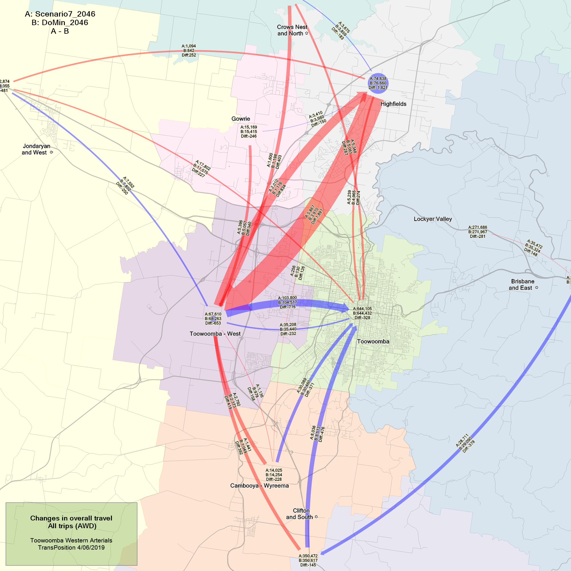
Desire line difference plot showing the change in travel demand when a new Arterial road is added to the Toowoomba network
Custom outputs
The flexibility of the TPACS model allows new plots to be developed and customised for different projects. Some of the common additional plots that have been created are travel time maps and select link analysis. The travel time plots allow the travel route and time between key locations to be compared between different modelling scenarios. Travel times to a key location can also be compared. For example the plot below show the production locations within 30min of the attraction in Ringwood, by comparing the times with and without the use of a toll road, we can highlight the benefit of a toll road in improving travel times and accessibility to an area.
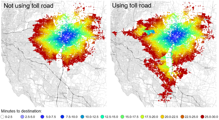
Travel time to Ringwood Melbourne, not using a toll road and with a toll road
The select link analysis plot shows all volumes in the network that contribute to a selected link. This output is beneficial for finding feeder roads to other main roads or toll roads. The figure below shows all volumes that contribute to the Western freeway in Brisbane.
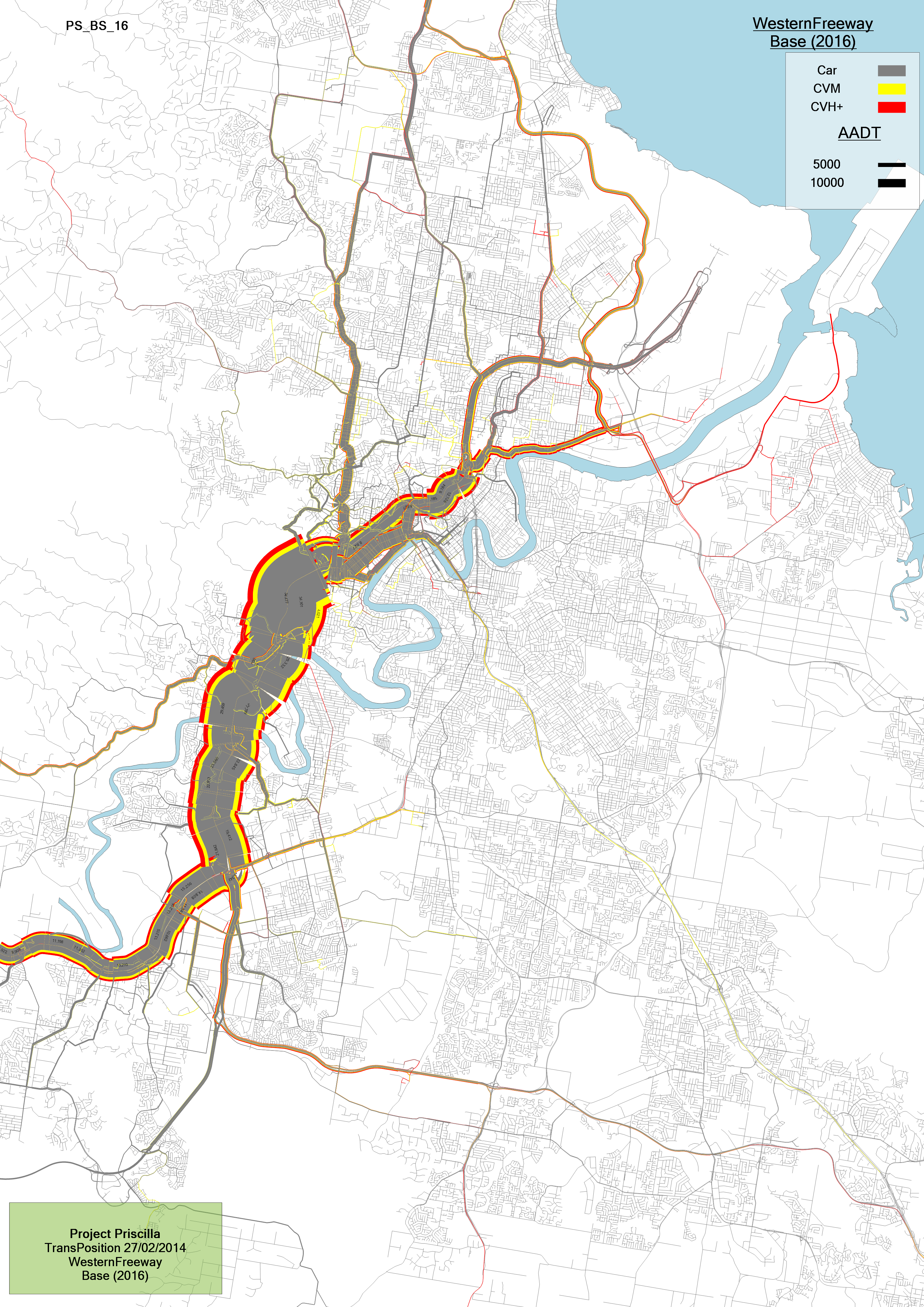
Select link plot showing volumes contributing to Western Freeway in Brisbane
Origin/destination matrix broken down by trip purpose and vehicle type can also be provided. Custom outputs can be generated to highlight public transport and active transport usage and volumes on the busways.
Hansen, Walter G. 1959. “Accessibility and Residential Growth.” PhD thesis, MassachusettsInstitute of Technology, and Scheurer, Jan, and Carey Curtis. 2007. “Accessibility Measures: Overview.”↩